2014 “Radiant Orchid” – Pantone Color of the Year and the Top Fashion Palettes
2014 was a year of color, creativity, and self-expression. At the heart of it all was Radiant Orchid—a captivating shade that took the spotlight as the Pantone Color of the Year. This vibrant mix of pink, purple, and fuchsia dominated fashion runways. This shade was everywhere – home decor, beauty products, and technology.
Let’s dive deeper into Radiant Orchid and the other top fashion colors for 2014.
Radiant Orchid: The Star Color of the Year 2014
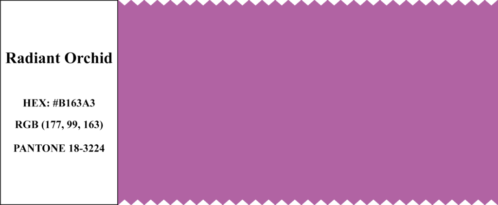
Pantone 18-3224 – Radiant Orchid was more than just a color; it was a symbol of creativity and originality. This hue sparked imagination, bringing joy and inspiration wherever it appeared. Executive Director of the Pantone Color Institute “Leatrice Eiseman” described Radiant Orchid as “an enchanting harmony of fuchsia, purple, and pink undertones”.
|
Color Name
|
Pantone Code
|
HEX Code
|
RGB Value
|
|---|---|---|---|
|
Radiant Orchid
|
18-3224
|
#B163A3
|
177, 99, 163
|
The meaning of that is “inspires confidence and emanates great joy, love, and health”. Radiant Orchid is a color that energizes and inspires. It’s a bold choice that makes a statement, whether in a dress or an accessory.

The Top Fashion Colors of 2014
Pantone’s Fashion Color Report for Spring 2014 featured a palette, which was diverse and harmonious. These colors were carefully chosen to reflect the mood of the year—one of balance, optimism, and new beginnings. Designers used these colors to create collections that were as vibrant as they were wearable.
1. Dazzling Blue
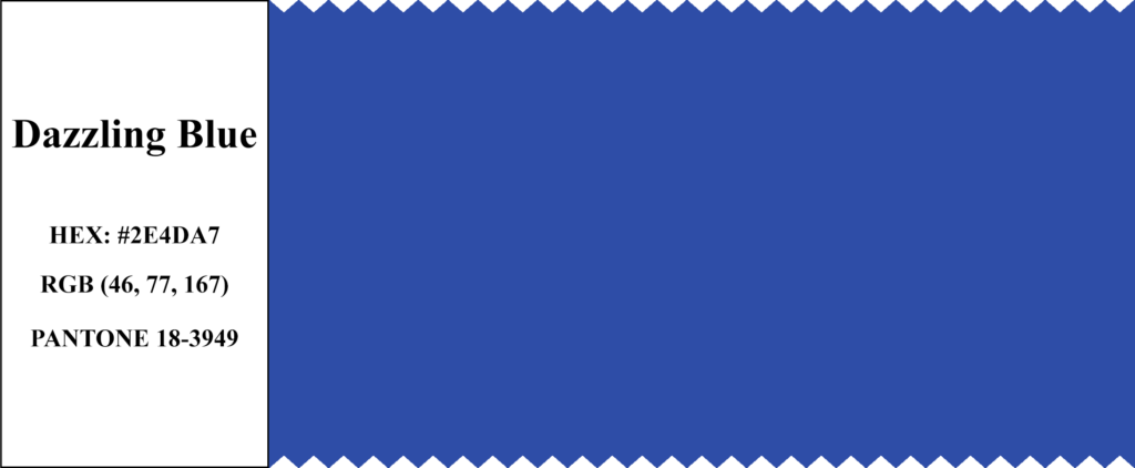
Pantone 18-3949 – Dazzling Blue was a bold, vibrant blue that stood out on the runway. It was a color that made a statement, whether used in a flowing gown or a tailored suit. This shade of blue was not just for the bold. It is a versatile color that could be both striking and sophisticated.
Dazzling Blue is a color that feels both strong and approachable. It is a shade that can be powerful and calming, depending on how we use it.
|
Color Name
|
Pantone Code
|
HEX Code
|
RGB Value
|
|---|---|---|---|
|
Dazzling Blue
|
18-3949
|
#2E4DA7
|
46, 77, 167
|
2. Violet Tulip
Pantone 16-3823 – Violet Tulip brought a touch of romance and nostalgia to the 2014 color palette. This soft, lavender shade was often paired with other pastels, creating a dreamy, vintage-inspired look. This color evoked memories of springtime and delicate flowers in bloom.
Violet Tulip is a soft and elegant shade. It’s perfect for creating a romantic, feminine look with a hint of vintage charm.

|
Color Name
|
Pantone Code
|
HEX Code
|
RGB Value
|
|---|---|---|---|
|
Violet Tulip
|
16-3823
|
#9C90C4
|
156, 144, 196
|
3. Sand
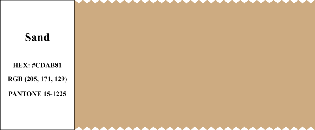
Pantone 15-1225 – Sand was the ultimate neutral for 2014. This warm, beige shade was versatile and easy to wear. That makes it a staple in many wardrobes. It’s a color that brings comfort and warmth. That feels much like the soft sand beneath your feet on a sunny beach.
Sand is the perfect neutral. It’s warm, and inviting, and works well with almost any color. That makes it a versatile choice for any wardrobe.
|
Color Name
|
Pantone Code
|
HEX Code
|
RGB Value
|
|---|---|---|---|
|
Sand
|
15-1225
|
#CDAB81
|
205, 171, 129
|
4. Hemlock
Pantone 15-6114 – Hemlock was a refreshing, soft green that brought a touch of nature into the 2014 palette. This shade was reminiscent of cool, shady forests and lush greenery. These make it a perfect choice for spring and summer collections. Hemlock was often seen in prints, adding a natural, organic feel to the designs.
Hemlock is a color that brings the outside in. It’s fresh, inviting, and versatile, making it a great choice for fashion and home decoration.

|
Color Name
|
Pantone Code
|
HEX Code
|
RGB Value
|
|---|---|---|---|
|
Hemlock
|
15-6114
|
#97C3A2
|
151, 195, 162
|
5. Paloma
Pantone 16-0000 – Paloma was a sophisticated gray that added elegance to the 2014 color palette. This shade was perfect for creating modern looks that were both timeless and contemporary. It was a favorite for minimalist designs, offering a neutral base that could be paired with any color.
Paloma is the epitome of understated elegance. It’s a neutral that stands out without being overpowering. Perfect for modern, minimalist designs.

|
Color Name
|
Pantone Code
|
HEX Code
|
RGB Value
|
|---|---|---|---|
|
Paloma
|
16-0000
|
#9E9D9C
|
158, 157, 156
|
6. Cayenne
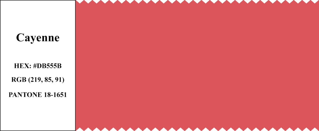
Pantone 18-1651 – Cayenne was a spicy, energetic red that added a bold pop of color to the fashion. This shade was all about passion and excitement, making it a perfect choice for statement pieces. To bring warmth and intensity to outfits, designers used this color as an accent.
Cayenne is a color that exudes energy and passion. It’s a bold choice for those who want to make a statement with their style.
|
Color Name
|
Pantone Code
|
HEX Code
|
RGB Value
|
|---|---|---|---|
|
Cayenne
|
18-1651
|
#DB555B
|
219, 85, 91
|
7. Freesia
Pantone 14-0852 – Freesia was a bright, sunny yellow that brought energy. This cheerful color was like a ray of sunshine. That makes it perfect for spring and summer collections. Designers often used Freesia in playful designs, adding a sense of fun and optimism to fashion.
Freesia is a color that radiates happiness. It’s a shade that instantly lifts your spirits and brings a smile.

|
Color Name
|
Pantone Code
|
HEX Code
|
RGB Value
|
|---|---|---|---|
|
Freesia
|
14-0852
|
#F3C336
|
243, 195, 54
|
8. Celosia Orange
Pantone 17-1360 – Celosia Orange was a lively, optimistic shade of orange that brought energy and excitement. This color was making a bold statement in eye-catching designs. Celosia Orange was a perfect selection for those who wanted to stand out and make an impact.
Celosia Orange is a color of life. It’s vibrant, energetic, and impossible to ignore—a perfect choice for making a bold fashion statement.

|
Color Name
|
Pantone Code
|
HEX Code
|
RGB Value
|
|---|---|---|---|
|
Celosia Orange
|
17-1360
|
#E87544
|
232, 117, 68
|
9. Radiant Orchid (Again!)
As mentioned earlier, Radiant Orchid was the Color of the Year, and it was also a top fashion color for 2014. This color was everywhere, from clothing and accessories to home decor and even in technology. It was a color that symbolized creativity and imagination.
|
Color Name
|
Pantone Code
|
HEX Code
|
RGB Value
|
|---|---|---|---|
|
Radiant Orchid
|
18-3224
|
#B163A3
|
177, 99, 163
|
10. Placid Blue
Pantone 15-3920 – Placid Blue was a soft, tranquil blue that brought a sense of calm and relaxation. This color was all about serenity and peace, making it a perfect choice for fashion and home decoration. Placid Blue was often used in soft, flowing designs that evoked the peacefulness of a clear blue sky.
Placid Blue is a color that soothes the soul. It’s a shade that brings peace and tranquility, whether in a flowing dress or a cozy bedroom.

|
Color Name
|
Pantone Code
|
HEX Code
|
RGB Value
|
|---|---|---|---|
|
Placid Blue
|
15-3920
|
#8DACD3
|
141, 172, 211
|
Trends Observed in 2014
2014 was a year where individuality and self-expression were key trends. 2024 color palettes offer endless creativity and personalization. The palette expresses boldness through vibrant colors like Dazzling Blue and Cayenne. Or softness through soothing shades like Paloma and Placid Blue. People were encouraged to express themselves through these colors.
In 2014, designers blended nature-inspired colors with modern, urban designs. Colors like Hemlock and Sand brought the outdoors inside. They harmoniously combined natural and contemporary styles. This trend appeared not only in fashion but also in home decor. Earthy tones paired with modern furniture and accessories created a fresh, stylish look.
Pantone Color Chart for 2014
|
Color Name
|
Pantone Code
|
HEX Code
|
RGB Value
|
|---|---|---|---|
|
Radiant Orchid
|
18-3224
|
#B163A3
|
177, 99, 163
|
|
Dazzling Blue
|
18-3949
|
#2E4DA7
|
46, 77, 167
|
|
Violet Tulip
|
16-3823
|
#9C90C4
|
156, 144, 196
|
|
Sand
|
15-1225
|
#CDAB81
|
205, 171, 129
|
|
Hemlock
|
15-6114
|
#97C3A2
|
151, 195, 162
|
|
Paloma
|
16-0000
|
#9E9D9C
|
158, 157, 156
|
|
Cayenne
|
18-1651
|
#DB555B
|
219, 85, 91
|
|
Freesia
|
14-0852
|
#F3C336
|
243, 195, 54
|
|
Celosia Orange
|
17-1360
|
#E87544
|
232, 117, 68
|
|
Placid Blue
|
15-3920
|
#8DACD3
|
141, 172, 211
|
Radiant Orchid, the Pantone Color of the Year 2014, and the top fashion colors of that year brought a vibrant and diverse palette to the world. These colors weren’t just trends. They became tools for self-expression, creativity, and inspiration. People wore these colors, decorated their homes with them, and enjoyed their beauty. In 2014, color truly came to life.
Today, these colors still influence fashion and design. They show that the right color can transcend time and trends. As you think back to 2014, remember the joy and creativity these colors brought. They continue to inspire us even now.


Copywrite © 2024 Bright Beryl