2015 “Marsala” – Pantone Color of the Year and the Top Fashion Palettes
2015 was a year of rich, warm colors that connected us to the earth and nature. The star of the year was Marsala (Pantone 18-1438). A deep reddish-brown that brought a sense of groundedness and elegance. But Marsala wasn’t alone. The Pantone Fashion Color Report 2015 introduced a range of colors that reflected moods, from calm and serene to vibrant and playful.
This article will guide you through these colors, breaking down their names, Pantone, hex, and RGB codes. We’ll also explore how these colors influenced fashion and design throughout the year. This article helps you deeply understand the colors that defined 2015, whether you’re a designer, color enthusiast, or trend follower.
Marsala: The Bold and Grounded Color of the Year 2015
In 2015, Pantone chose Marsala as the Color of the Year. This choice was significant because Marsala is a color that goes beyond just being a trend. It’s a color that feels grounded and rooted in the earth.

|
Color Name
|
Pantone Code
|
HEX Code
|
RGB Value
|
|---|---|---|---|
|
Marsala
|
18-1438
|
#964F4C
|
150, 79, 76
|
Marsala’s richness made it perfect for both fashion and interiors. In fashion, designers use it for everything, from luxurious fabrics like velvet and leather to everyday items like sweaters and scarves. Its deep, warm tone made it ideal for fall and winter. That adds a touch of sophistication and comfort to any outfit.
In interiors, designers use Marsala to create cozy and inviting spaces. Think of a living room with Marsala-colored cushions or a bedroom with rich Marsala bedding. This color added warmth and elegance, making any space feel more intimate and welcoming.

Exploring the Top Fashion Colors of 2015
While Marsala was the star, the Pantone Fashion Color Report for 2015 introduced other beautiful shades that complemented and contrasted with it. These colors were carefully chosen to reflect the different moods and needs of the year.
1. Aquamarine: The Calm and Cool Blue
Aquamarine is a soothing, light blue that brings to mind the clear waters of a tropical sea. Designers loved this color for spring and summer collections. And use it to create a calm, serene vibe in flowing dresses, lightweight scarves, and casual tops. It’s a color that feels fresh and breezy, perfect for a day at the beach or a relaxed weekend.

|
Color Name
|
Pantone Code
|
HEX Code
|
RGB Value
|
|---|---|---|---|
|
Aquamarine
|
14-4313
|
#9CC3D5
|
156, 195, 213
|
2. Scuba Blue: The Vibrant and Playful
Scuba Blue is a bright, energizing shade that makes you think of tropical vacations and underwater adventures. It’s a playful color that adds a sense of fun and excitement to any outfit. In 2015, Scuba Blue was popular in beachwear and casual outfits. You could find it in swimsuits, sunglasses, and even shoes. It’s a color that says, “Let’s have some fun!”

|
Color Name
|
Pantone Code
|
HEX Code
|
RGB Value
|
|---|---|---|---|
|
Scuba Blue
|
16-4725
|
#00B2CA
|
0, 178, 202
|
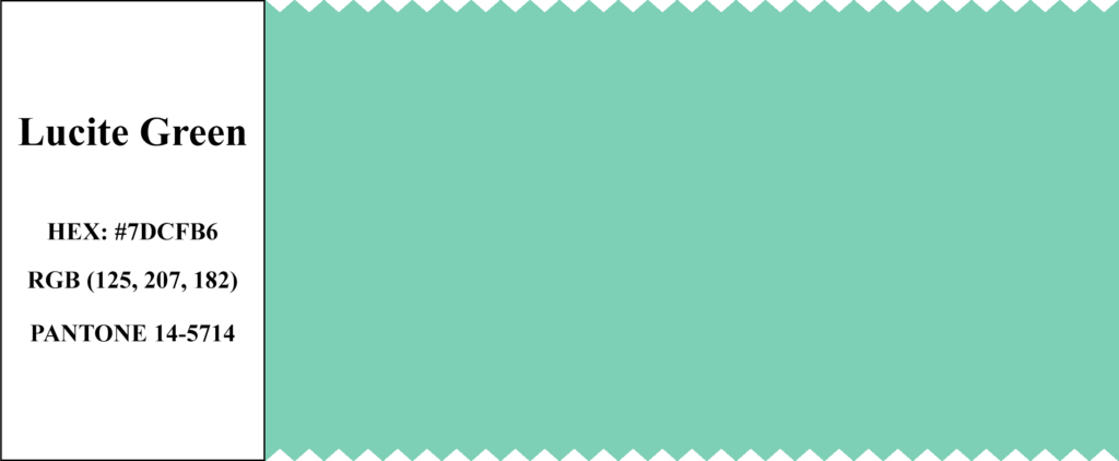
3. Lucite Green: The Fresh and Minty Green
Lucite Green is a soft, minty shade that feels light and airy. It’s a refreshing color that brings a sense of calm and clarity. Designers used this color in delicate fabrics and flowing designs, perfect for spring fashion. Designers often paired Lucite Green with other pastel colors to create a soft, harmonious look. It’s a color that makes you feel at ease, like a cool breeze on a warm day.
|
Color Name
|
Pantone Code
|
HEX Code
|
RGB Value
|
|---|---|---|---|
|
Lucite Green
|
14-5714
|
#7DCFB6
|
125, 207, 182
|
4. Classic Blue: The Timeless and Trustworthy Blue
Classic Blue is a strong, reliable shade of blue that never goes out of style. It’s a color that feels modern and timeless, making it a favorite for formal wear and evening outfits.
In 2015, designers used Classic Blue to create sophisticated and elegant looks. Designers incorporated it into everything from suits and evening gowns to accessories like ties and handbags. Classic Blue adds a touch of refinement to any outfit.

|
Color Name
|
Pantone Code
|
HEX Code
|
RGB Value
|
|---|---|---|---|
|
Classic Blue
|
19-4052
|
#34558B
|
52, 85, 139
|
5. Toasted Almond: The Warm and Versatile Neutral
Toasted Almond is a warm, earthy neutral that feels natural and comforting. This versatile color suits both casual and formal settings. In 2015, Toasted Almond was popular in everything from cozy sweaters to elegant dresses.
This color is perfect for those who prefer a subtle, understated look. It pairs well with almost any color, making it a great choice for layering and accessorizing.

|
Color Name
|
Pantone Code
|
HEX Code
|
RGB Value
|
|---|---|---|---|
|
Toasted Almond
|
14-1213
|
#D1B099
|
209, 176, 153
|
6. Strawberry Ice: The Sweet and Charming Pink
Strawberry Ice is a delicate pink that feels sweet. This color adds a feminine touch, making it a favorite for spring and summer fashion. Strawberry Ice appeared often in floral patterns and soft fabrics in 2015. This color evokes warm, sunny days and fresh, juicy strawberries.

|
Color Name
|
Pantone Code
|
HEX Code
|
RGB Value
|
|---|---|---|---|
|
Strawberry Ice
|
16-1720
|
#E48990
|
228, 137, 144
|
7. Tangerine: The Bright and Energetic Orange
Tangerine is a lively, cheerful orange that brings a burst of energy to any outfit. It’s a color that’s full of life, making it perfect for summer collections. Designers used Tangerine in sporty, casual looks, including tank tops, shorts, sneakers, and hats. It’s all about fun and staying active.

|
Color Name
|
Pantone Code
|
HEX Code
|
RGB Value
|
|---|---|---|---|
|
Tangerine
|
15-1247
|
#F7955D
|
247, 149, 93
|
8. Custard: The Soft and Sunny Yellow
Custard is a warm, buttery yellow that feels comforting and happy. This color brings a sense of light and joy, perfect for spring and summer. In 2015, designers added a sunny touch to outfits with Custard, perfect for dresses, skirts, and accessories.

|
Color Name
|
Pantone Code
|
HEX Code
|
RGB Value
|
|---|---|---|---|
|
Custard
|
13-0720
|
#E8D88D
|
232, 216, 141
|
9. Marsala: The Rich and Earthy Hue
As we mentioned earlier, Marsala was not just the Color of the Year, but also one of the top fashion colors for 2015. Its deep, earthy tone made it perfect for fall and winter collections. Designers used Marsala to create warm, luxurious looks that felt elegant and comfortable.
You could see Marsala in everything from leather jackets and boots to cozy sweaters and scarves. This color adds depth and richness to any outfit, making it a go-to choice for the colder months.
10. Glacier Gray: The Cool and Calming Neutral
Glacier Gray is a soft, cool gray that brings a sense of calm and sophistication. This neutral color pairs well with almost any shade, making it versatile for fashion and interiors.
In 2015, designers used Glacier Gray to balance out brighter colors in outfits. It’s a color that adds a subtle touch of elegance, whether in a tailored suit or a minimalist dress. This shade was also popular in home decor, where it added a modern, clean look to spaces.

|
Color Name
|
Pantone Code
|
HEX Code
|
RGB Value
|
|---|---|---|---|
|
Glacier Gray
|
14-4102
|
#C5C9CA
|
197, 201, 202
|
The Influence of 2015’s Colors on Fashion
The colors of 2015 were more than just shades on a palette. They reflected the moods and trends of the year, influencing everything from fashion to interior design.
- In 2015, designers drew inspiration from nature and simplicity. The earthy tones of Marsala, Toasted Almond, and Glacier Gray connected us to the world around us, bringing a sense of calm and comfort. These colors were perfect for creating looks that felt natural and grounded.
- On the other hand, brighter shades like Scuba Blue, Tangerine, and Strawberry Ice added a sense of fun and playfulness to the year’s fashion. These colors were about enjoying life and embracing the moment. These colors were perfect for summer collections, adding energy and excitement to casual and sporty looks.
- The softer colors like Aquamarine, Lucite Green, and Custard brought a sense of peace and tranquility. Designers used these shades to create soothing, harmonious outfits that felt light and breezy. They were ideal for spring when the world is fresh and full of life.
- Marsala, the Color of the Year 2015, stood out for its depth and richness. It was a color that could be both bold and understated, making it versatile and timeless. Whether used in fashion or interiors, Marsala added a touch of elegance and warmth, making it a favorite for the year.
Pantone Color Chart for 2015
|
Color Name
|
Pantone Code
|
HEX Code
|
RGB Value
|
|---|---|---|---|
|
Marsala
|
18-1438
|
#964F4C
|
150, 79, 76
|
|
Aquamarine
|
14-4313
|
#9CC3D5
|
156, 195, 213
|
|
Scuba Blue
|
16-4725
|
#00B2CA
|
0, 178, 202
|
|
Lucite Green
|
14-5714
|
#7DCFB6
|
125, 207, 182
|
|
Classic Blue
|
19-4052
|
#34558B
|
52, 85, 139
|
|
Toasted Almond
|
14-1213
|
#D1B099
|
209, 176, 153
|
|
Strawberry Ice
|
16-1720
|
#E48990
|
228, 137, 144
|
|
Tangerine
|
15-1247
|
#F7955D
|
247, 149, 93
|
|
Custard
|
13-0720
|
#E8D88D
|
232, 216, 141
|
|
Glacier Gray
|
14-4102
|
#C5C9CA
|
197, 201, 202
|
The colors of 2015 were more than just trends; they were a reflection of the year’s spirit. From Marsala’s rich, earthy tones to Tangerine and Scuba Blue’s bright, playful shades, these colors brought balance, joy, and elegance to fashion and design.
As we look back on 2015, these colors continue to inspire. They remind us of the beauty of simplicity, the warmth of nature, and the importance of having fun. Whether you’re a designer, an artist, or simply love color, the 2015 palette will always hold a special place in your heart.


Copywrite © 2024 Bright Beryl