Pantone made a groundbreaking choice in 2016. For the first time in history, they selected two colors for their Color of the Year: Rose Quartz and Serenity. These two soft, yet distinct shades were more than just color trends. They reflected deeper societal themes and emotions. This unique pairing was intended to convey a message of balance and harmony during global uncertainty.
Pantone’s decision to choose two colors was bold and innovative, reflecting the fluidity of modern life. Let’s dive deeper into the details of these colors and explore why they made such an impact in 2016.
The Pantone Color of the Year 2016: Rose Quartz
Rose Quartz is a soft, gentle pink that embodies compassion and calmness. This hue brings a sense of warmth and comfort, making it perfect for creating inviting environments. Rose Quartz is often associated with love and nurturing. That makes it a favorite choice in both fashion and home decoration.

|
Color Name
|
Pantone Code
|
HEX Code
|
RGB Value
|
|---|---|---|---|
|
Rose Quartz
|
13-1520
|
#F7CAC9
|
247, 202, 201
|
Symbolism and Meaning:
- Compassion: Encourages empathy and understanding.
- Warmth: Creates a cozy and welcoming atmosphere.
- Love: Represents affection and care.
Applications:
- Fashion: Dresses, blouses, and accessories in Rose Quartz add a touch of elegance and softness.
- Home Decoration: Perfect for bedrooms and living rooms. Rose Quartz cushions, curtains, and wall paint can make spaces feel more inviting.
- Beauty: Popular in makeup and nail art for a fresh and natural look.

The Pantone Color of the Year 2016: Serenity
Serenity is a tranquil blue that exudes peace and relaxation. This calming shade is reminiscent of clear skies and serene waters. That makes it ideal for spaces where relaxation is key. Serenity is versatile and pairs well with many other colors, enhancing its popularity in various design fields.

|
Color Name
|
Pantone Code
|
HEX Code
|
RGB Value
|
|---|---|---|---|
|
Serenity
|
15-3919
|
#92A8D1
|
146, 168, 209
|
Symbolism and Meaning:
- Calmness: Promotes a sense of tranquility and peace.
- Clarity: Represents clear thinking and focus.
- Balance: Helps create a harmonious environment.
Applications:
- Fashion: Serenity is used in casual and formal wear, adding a soothing touch to outfits.
- Interior Design: Ideal for bedrooms, bathrooms, and offices to create a peaceful ambiance.
- Graphic Design: Used in branding and marketing to convey reliability and calmness.

The Harmony of Dual Colors
Pantone’s decision to pair Rose Quartz and Serenity was revolutionary. Traditionally, one color would represent the year’s theme, but Pantone chose to highlight the balance between two complementary colors. This dual selection emphasizes the importance of harmony and interconnectedness in our lives.
Breaking Gender Norms:
- Rose Quartz is often linked to femininity, while Serenity is associated with masculinity. Together, they challenge traditional gender norms, promoting inclusivity and diversity.
- Fluidity: The combination encourages flexibility and the blending of different ideas and perspectives.
Emotional Balance:
- Calm and Compassion: Rose Quartz brings warmth, while Serenity offers calmness. Together, they create a balanced emotional environment.
- Stress Relief: These colors help reduce stress and promote mental well-being. Those colors are perfect for both personal and professional spaces.
Expanded Applications in Design
1. Fashion:
- Runway Shows: Designers showcased collections featuring Rose Quartz and Serenity, creating stunning and harmonious outfits.
- Everyday Wear: These colors are easy to incorporate into daily attire, from casual tees to elegant evening gowns.
- Accessories: Bags, shoes, and jewelry in these hues add subtle pops of color to any outfit.
2. Interior Design:
- Living Rooms: Combining Rose Quartz and Serenity can create a balanced and inviting space. Think Rose Quartz sofas with Serenity throw pillows.
- Kitchens: Serenity cabinets paired with Rose Quartz accents like curtains or dishware add a fresh and modern touch.
- Bathrooms: Serenity tiles with Rose Quartz towels create a spa-like atmosphere.
3. Graphic Design:
- Branding: Companies use these colors to evoke trust and warmth in their logos and marketing materials.
- Web Design: Websites featuring Rose Quartz and Serenity are visually appealing and user-friendly.
- Advertising: These colors help convey messages of peace, care, and reliability.
Cultural and Global Impact
1. Art and Creativity:
- Arts: Artists used these colors in paintings and installations, exploring themes of peace and compassion.
- Crafts: DIY enthusiasts incorporated these hues into handmade projects, from candles to knitted scarves.
2. Technology:
- Device Design: Tech gadgets and accessories in Rose Quartz and Serenity offered a softer alternative to traditional colors.
- Apps and Interfaces: User interfaces featuring these colors provided a more calming and enjoyable user experience.
3. Social Media:
- Aesthetic Trends: Influencers and content creators used Rose Quartz and Serenity to create visually cohesive and soothing social media feeds.
- Hashtags: #RoseQuartz and #Serenity trended, showcasing how people incorporated these colors into their lives.
Historical Context and Selection Process
Pantone’s selection process for the Color of the Year is meticulous and involves analyzing global trends in various industries, including fashion, entertainment, and social media. For 2016, the choice of two colors was unprecedented and reflected the complex global landscape.
Global Trends Considered:
- Social Change: The selection mirrored a desire for unity and harmony amidst political and social upheaval.
- Economic Factors: As economies fluctuated, the colors represented stability and comfort.
- Cultural Shifts: Emphasis on diversity and breaking traditional norms influenced the dual color choice.
Expert Collaboration:
Pantone collaborates with experts across different fields to ensure the chosen colors resonate universally. In 2016, the collaboration led to the harmonious pairing of Rose Quartz and Serenity, symbolizing a collective aspiration for peace and compassion.
Future Influence and Legacy
Sustainable Design:
- Eco-Friendly Products: These colors are popular in sustainable fashion and eco-friendly home products, promoting a connection with nature.
- Recycling Initiatives: Packaging in Rose Quartz and Serenity encourages environmentally conscious choices.
Mental Health Awareness:
- Therapeutic Spaces: Colors are used in therapy rooms and wellness centers to create calming environments.
- Mindfulness Practices: Incorporating these hues in meditation spaces enhances relaxation and focus.
Technology and Innovation:
- Smart Homes: Devices and smart home accessories in these colors blend seamlessly with modern interiors.
- Virtual Reality: Serenity and Rose Quartz are used in virtual environments to create immersive and peaceful experiences.
The Top Fashion Colors of 2016 – Autumn/Winter/Fall
Pantone didn’t just stop with “Rose Quartz” or “Serenity”. Every year, they release the “Fashion Color Report”, highlighting the top colors that will dominate the fashion world. The 2016 report was filled with a mix of vibrant and subtle hues that appealed to a wide range of tastes.
Let’s explore each of these colors in detail.


Pantone Color Chart for 2016 – Autumn/Winter/Fall
|
Color Name
|
Pantone Code
|
HEX Code
|
RGB Value
|
|---|---|---|---|
|
Dusty Cedar
|
18-1630
|
#AD5D5D
|
173, 93, 93
|
|
Bodacious
|
17-3240
|
#B76BA3
|
183, 107, 163
|
|
Aurora Red
|
18-1550
|
#B93A32
|
185, 58, 50
|
|
Airy Blue
|
14-4122
|
#92B6D5
|
146, 182, 213
|
|
Warm Taupe
|
16-1318
|
#AF9483
|
175, 148, 131
|
|
Spicy Mustard
|
14-0952
|
#D8AE47
|
216, 174, 71
|
|
Sharkskin
|
17-3914
|
#838487
|
131, 132, 135
|
|
Riverside
|
17-4028
|
#4C6A92
|
76, 106, 146
|
|
Potter's Clay
|
18-1340
|
#9E4624
|
158, 70, 36
|
|
Lush Meadow
|
18-5845
|
#006E51
|
0, 110, 81
|
The Top Fashion Colors of 2016 – Spring/Summer


Pantone Color Chart for 2016 – Spring/Summer
|
Color Name
|
Pantone Code
|
HEX Code
|
RGB Value
|
|---|---|---|---|
|
Buttercup
|
12-0752
|
#FAE03C
|
250, 224, 60
|
|
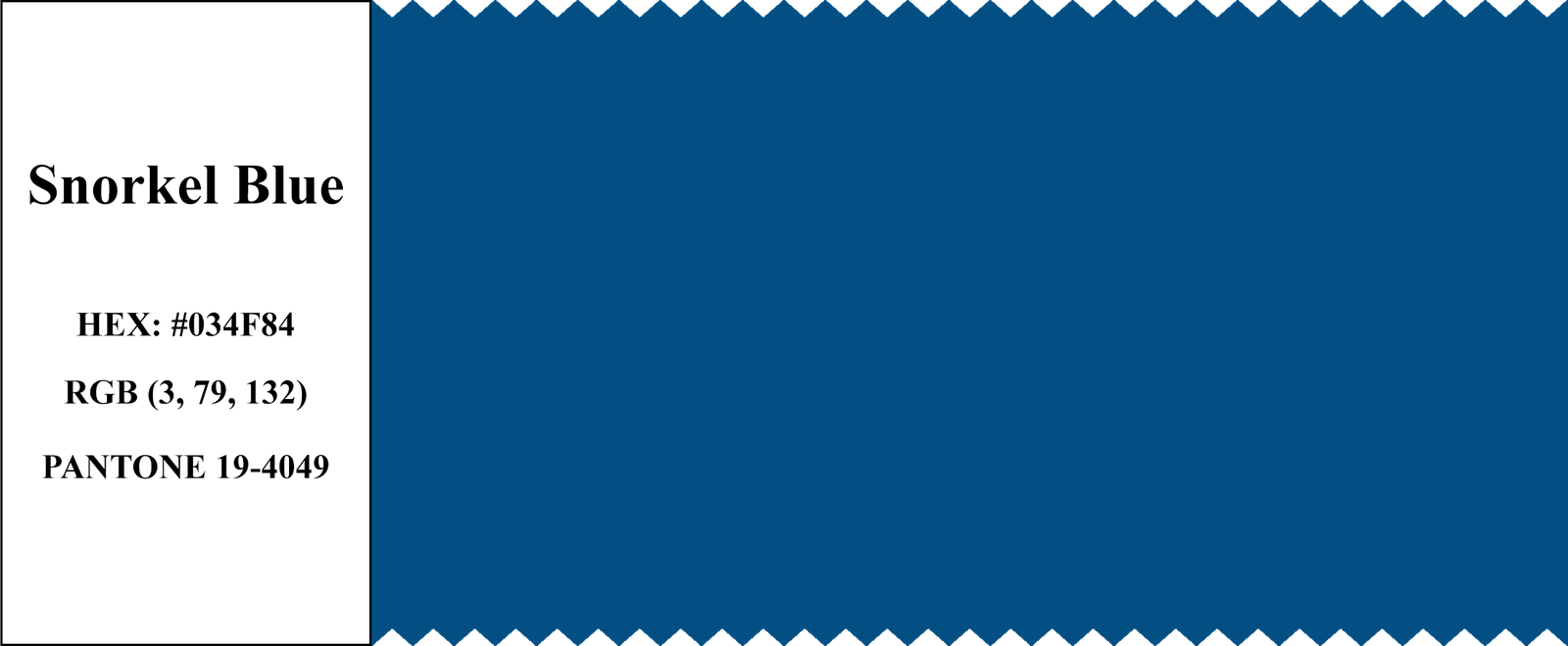
Snorkel Blue
|
19-4049
|
#034F84
|
3, 79, 132
|
|
Serenity
|
15-3919
|
#92A8D1
|
146, 168, 209
|
|
Iced Coffee
|
15-1040
|
#B18F6A
|
177, 143, 106
|
|
Rose Quartz
|
13-1520
|
#F7CAC9
|
247, 202, 201
|
|
Limpet Shell
|
13-4810
|
#98DDDE
|
152, 221, 222
|
|
Green Flash
|
15-0146
|
#79C753
|
121, 199, 83
|
|
Lilac Grey
|
13-3804
|
#9896A4
|
152, 150, 164
|
|
Fiesta
|
17-1564
|
#DD4132
|
221, 65, 50
|
|
Peach Echo
|
16-1548
|
#F7786B
|
247, 120, 107
|
In 2016, Pantone chose Rose Quartz and Serenity as the Colors of the Year. These colors symbolize calm, balance, and harmony. They encouraged us to slow down and find peace in a busy world. To create soothing and beautiful looks in fashion, and home decoration – designers use these colors.
The Pantone Fashion Color Report for Spring and Fall 2016 showcased other lovely colors, too. In Spring, colors like Peach Echo, Lilac Gray, and Buttercup brought warmth and vibrancy. In Fall, deeper shades like Warm Taupe, Potter’s Clay, and Riverside added richness and depth to the season’s palette.
Together, these colors reflected the mood and trends of 2016, helping us express ourselves through fashion and design. They remind us of the power of color to influence our emotions and bring beauty into our lives.


Copywrite © 2024 Bright Beryl