2017 “Greenery” – Pantone Color of the Year and Fashion Trends (Spring and Fall)
Every year, Pantone selects a color that captures the mood and spirit of the times. In 2017, that color was Greenery. It’s a bright, fresh green that reminds us of nature. Greenery symbolizes new beginnings. It is a color that brings a sense of peace and renewal.
In this article, we will explore Greenery in detail and look at the Pantone Fashion Color Report for 2017. This report shows the top fashion colors for Spring and Fall, with each color’s Pantone number, hex, and RGB codes (*approximate values intended to simulate the colors*).
The Pantone Color of the Year 2017: Greenery
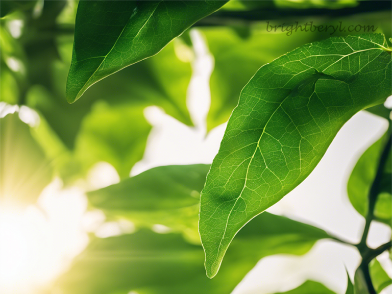
Greenery is a yellow-green color that stands out. Its bright, vibrant tone makes it perfect for adding energy and life to any space. Greenery is versatile and dynamic, whether used as a statement color or an accent.
This color works well in many settings. It can be bold and dramatic or soft and soothing. That depends on its use. Greenery’s brightness makes it ideal for creating focal points in a room or an outfit. It’s a color that draws attention. Creates a sense of freshness and renewal.

|
Color Name
|
Pantone Code
|
HEX Code
|
RGB Value
|
|---|---|---|---|
|
Greenery
|
15-0343
|
#88B04B
|
136, 176, 75
|
The Inspiration Behind Greenery
Pantone selected Greenery (Pantone 15-0343) as the Color of the Year 2017. This choice reflected the world’s growing desire for renewal and fresh beginnings. People were feeling overwhelmed by fast-paced lives and constant digital connections. They craved a return to simpler, more natural surroundings. Greenery, a vibrant yellow-green, became a symbol of that desire.
Greenery reminds us of the first days of spring. It’s the color of new leaves and fresh shoots. This color brings to mind the smell of fresh grass and the feeling of warm sunshine. It’s a hue that encourages us to take a deep breath and enjoy the moment.
Pantone chose Greenery to inspire us. It calls for a break from the stress and noise of modern life. This color encourages us to reconnect with nature and with ourselves. It offers a fresh start, full of energy and possibility.
Greenery in Fashion and Design
Greenery quickly became a favorite in fashion and design. Its bright, lively tone made it perfect for creating eye-catching looks. Designers used it to add a fresh pop of color to clothing, accessories, and even makeup.
1. Fashion
In fashion, Greenery appeared in many ways. Designers used it in bold, head-to-toe outfits. They also paired it with other colors to create striking combinations. Greenery worked well with neutrals, bright colors, and even metallics. This versatility made it a hit on runways and in everyday wear.
2. Home Decoration
Home decoration also embraced Greenery. People wanted to bring the freshness of nature inside their homes. Greenery became a popular choice for walls, furniture, and decorative items. It added life and energy to living rooms, bedrooms, and kitchens.

3. Graphic Design
In graphic design, Greenery provided a fresh and modern touch. Designers used it in logos, websites, and advertisements. It gave their work a sense of vibrancy and renewal. The greenery’s bright tone made it stand out in print and digital media alike.
The Psychological Impact of Greenery
1. Colors can change how we feel, and Greenery has a powerful effect. Green is a color that makes us feel calm and balanced. It’s a color that reminds us of nature, growth, and renewal. Greenery, with its yellow undertones, adds warmth and energy to that calm.
2. When we see Greenery, we feel refreshed and revitalized. This color helps reduce stress and promotes relaxation. It’s a color that encourages us to slow down and enjoy the present moment. Greenery also inspires creativity and new ideas. It’s a color that opens our minds to new possibilities.
3. Many people found comfort in Greenery during 2017. They used it to create spaces that felt peaceful and rejuvenating. Greenery became a symbol of hope and renewal, helping people feel more connected to the world around them.
Greenery’s Role in a Global Context
Greenery wasn’t just a color; it was a statement. In 2017, the world was becoming more aware of environmental issues. People were thinking more about sustainability and their impact on the planet. Greenery reflected this growing concern for the environment.
This color encouraged people to live in harmony with nature. It inspired them to make eco-friendly choices and support green initiatives. Greenery became a symbol of the movement towards a more sustainable future.
The choice of Greenery also highlighted the importance of unity. Green is a color that resonates with people from all cultures and backgrounds. It’s a universal symbol of life, growth, and renewal. In a time of global challenges, Greenery served as a reminder of our shared connection to the Earth.
Pairing Greenery with Other Colors
One of the strengths of Greenery is its ability to pair well with many other colors. It’s a versatile color that can complement a wide range of tones. Here are some ways to pair Greenery with other colors:
Neutrals: Pairing Greenery with neutral colors like white, beige, or gray creates a clean and fresh look. The neutral tones balance the brightness of the Greenery. That makes it the focal point of the design.
Bright Colors: Greenery pairs beautifully with bright colors like blue, yellow, and pink. These combinations are bold and energetic, perfect for making a statement in fashion or design.
Earth Tones: When paired with earth tones like “browns and deep greens”, Greenery takes on a more natural and grounded feel. This combination is ideal for creating a connection with nature in home décor and fashion.
Metallics: Greenery also works well with metallic colors like gold, silver, and bronze. These pairings add a touch of sophistication and luxury, making Greenery suitable for elegant designs and formal wear.
These pairings show how versatile Greenery can be. It’s a color that can be adapted to fit any style or mood.
The Pantone Fashion Color Report 2017 – Fall/Autumn/Winter
Pantone releases a Fashion Color Report twice a year. This report highlights the top colors used by fashion designers in their collections. For 2017, there were two reports: one for Fall and another for Spring. Let’s explore both.


Pantone Color Chart for 2017 – Fall/Autumn/Winter
|
Color Name
|
Pantone Code
|
HEX Code
|
RGB Value
|
|---|---|---|---|
|
Grenadine
|
17-1558
|
#DC4C46
|
220, 76, 70
|
|
Ballet Slipper
|
13-2808
|
#F3D6E4
|
243, 214, 228
|
|
Tawny Port
|
19-1725
|
#672E3B
|
103, 46, 59
|
|
Golden Lime
|
16-0343
|
#9C9A40
|
156, 154, 64
|
|
Marina
|
17-4041
|
#4F84C4
|
79, 132, 196
|
|
Shaded Spruce
|
19-4524
|
#005960
|
0, 89, 96
|
|
Butterum
|
16-1341
|
#C48F65
|
196, 143, 101
|
|
Neutral Gray
|
17-4402
|
#898E8C
|
137, 142, 140
|
|
Autumn Maple
|
17-1145
|
#D2691E
|
210, 105, 30
|
|
Navy Peony
|
19-4029
|
#223A5E
|
34, 58, 94
|
The Pantone Fashion Color Report 2017 – Spring/Summer


Pantone Color Chart for 2017 – Spring/Summer
|
Color Name
|
Pantone Code
|
HEX Code
|
RGB Value
|
|---|---|---|---|
|
Pale Dogwood
|
13-1404
|
#EDCDC2
|
237, 205, 194
|
|
Flame
|
17-1462
|
#F2552C
|
242, 85, 44
|
|
Lapis Blue
|
19-4045
|
#004B8D
|
0, 75, 141
|
|
Greenery
|
15-0343
|
#88B04B
|
136, 176, 75
|
|
Primrose Yellow
|
13-0755
|
#F6D155
|
246, 209, 85
|
|
Pink Yarrow
|
17-2034
|
#CE3175
|
206, 49, 117
|
|
Niagara
|
17-4123
|
#578CA9
|
87, 140, 169
|
|
Kale
|
18-0107
|
#CE3175
|
90, 114, 71
|
|
Island Paradise
|
14-4620
|
#95DEE3
|
149, 222, 227
|
|
Hazelnut
|
14-1315
|
#CFB095
|
207, 176, 149
|
How to Use These Colors!
These colors are not just for fashion. They can be used in many areas of life. Here’s how you can use them:
- Fashion: Wear these colors in your clothing, accessories, and makeup. Mix and match them to create different looks.
- Home Decoration: Use these colors to decorate your home. Paint your walls, choose furniture, or add accents like pillows and curtains.
- Graphic Design: These colors can make your designs pop. Use them in logos, websites, and advertising materials.
- Events: Planning a wedding or a party? These colors can set the tone. Use them in your invitations, decorations, and even in your menu.
The colors of 2017 were vibrant, refreshing, and full of life. Greenery, the Pantone Color of the Year, set the tone with its fresh, natural vibe. The Spring and Fall color palettes offered a wide range of options, from bright and cheerful to deep and comforting. These colors can be used in many aspects of life, from fashion and home décor to graphic design and events. As we move forward, let these colors inspire you to bring a sense of renewal and balance into your life.


Copywrite © 2024 Bright Beryl