Colors are not just about what we see; they play a significant role in shaping our feelings and perceptions. Whether in nature, art, or design, colors can set the mood, convey a message, or simply make something look more appealing. One of the most effective ways to use color is through an “Analogous Color Scheme”. A technique that effortlessly brings harmony and unity to any space or design.
What Are Analogous Colors?
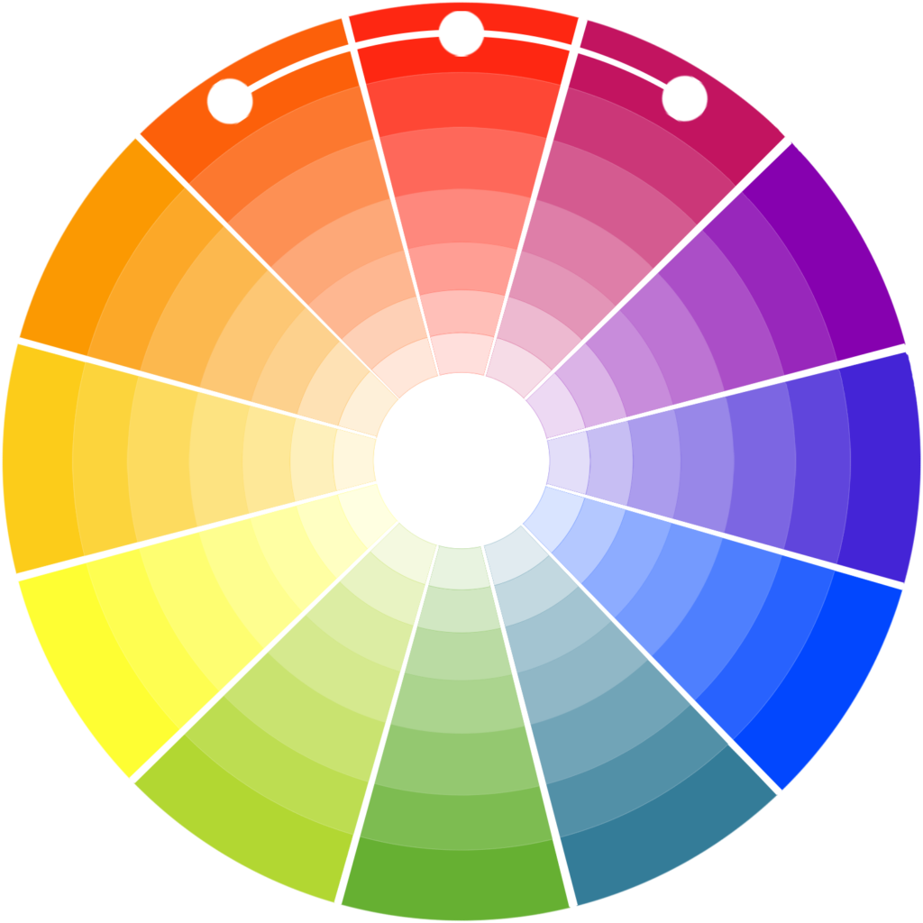
Analogous colors are like close friends on the color wheel. They sit right next to each other and share similar hues. Because they are so closely related, these colors blend together smoothly. Imagine a sunset where the sky shifts from shades of pink to orange to yellow, or a serene landscape where the blue sky gradually merges with the green hills below. These are examples of analogous colors in nature, and they create a soothing, continuous flow that is easy on the eyes.
When you use analogous colors, you create a sense of cohesion because the colors naturally transition from one to another. This technique can make any visual composition look well-thought-out and balanced, whether you’re decorating a room, creating a piece of art, or designing a website.
Why Analogous Colors Work So Well?
Analogous color schemes work wonderfully because they create a sense of peace and balance. These colors naturally fit together, which is why we often see them in nature. This natural harmony makes them especially effective when you want to evoke certain feelings or create a specific atmosphere in a space. For example, using blues and greens can make a room feel calm and serene while using reds, oranges, and yellows can make a space feel warm and inviting.
The beauty of analogous colors lies in their versatility. They can be soft and subtle, perfect for creating a relaxed environment, or they can be bold and vibrant, ideal for making a statement. The key is in how you combine and balance them, ensuring that the colors work together to enhance the overall feel of the space.
How to Use Analogous Colors in a Living Room?
Let’s explore how you might use an analogous color scheme to design a cozy living room that invites relaxation after a long day.
1. Pick a Main Color:
Start by selecting a dominant color that sets the tone for the room. For a warm and cozy atmosphere, you might choose a rich, warm shade of red. This color will be the foundation upon which the rest of the room is built.
2. Choose Neighboring Colors:
Next, pick two or three colors that sit next to your main color on the color wheel. If your main color is red, you might choose orange and yellow as your neighboring colors. These hues will naturally complement the red and add depth and interest to the room.
3. Balance Light and Dark:
It’s important to balance the intensity of the colors to create a harmonious look. Use lighter shades of your chosen colors to brighten the space and make it feel welcoming. For instance, you could incorporate lighter tints of red, orange, and yellow in the walls, curtains, or upholstery. Then, add some darker shades to create contrast and depth. A deep burgundy throw pillow or a dark orange rug can add richness without overwhelming the room.
4. Add Accents:
Accessories and accent pieces are the final touches that bring everything together. Look for items like throw pillows, artwork, or decorative objects in your chosen color palette. These small touches will tie the room together and reinforce the cohesive look you’re aiming for.
5. Final Details:
To complete the design, add some natural elements that complement your color scheme. Wooden furniture, potted plants, or even a basket of fresh fruit can add texture and warmth to the room. Soft lighting, such as table lamps with warm-toned shades, and plush fabrics like a cozy blanket or a soft rug, will enhance the room’s cozy ambiance, making it a perfect place to unwind.
Analogous color schemes are a powerful tool for creating visually appealing and emotionally resonant designs. By using colors that naturally go together, you can craft spaces, artworks, or websites that feel harmonious and inviting. The seamless transition between colors not only pleases the eye but also creates a unified and balanced look.
Whether you’re designing a peaceful bedroom, crafting a beautiful painting, or putting together a stunning website – the principles of analogous color harmony can help you achieve your vision. By carefully selecting and combining colors that sit next to each other on the color wheel, you can create a masterpiece of color. So, the next time you embark on a creative project, consider the magic of analogous colors to bring your ideas to life.