Colors have a special power in art and design. Knowing how to use them can make your work truly stand out. One of the best ways to use colors is by using what’s called the Complementary Color Scheme. This method is all about pairing colors that are opposites on the color wheel.
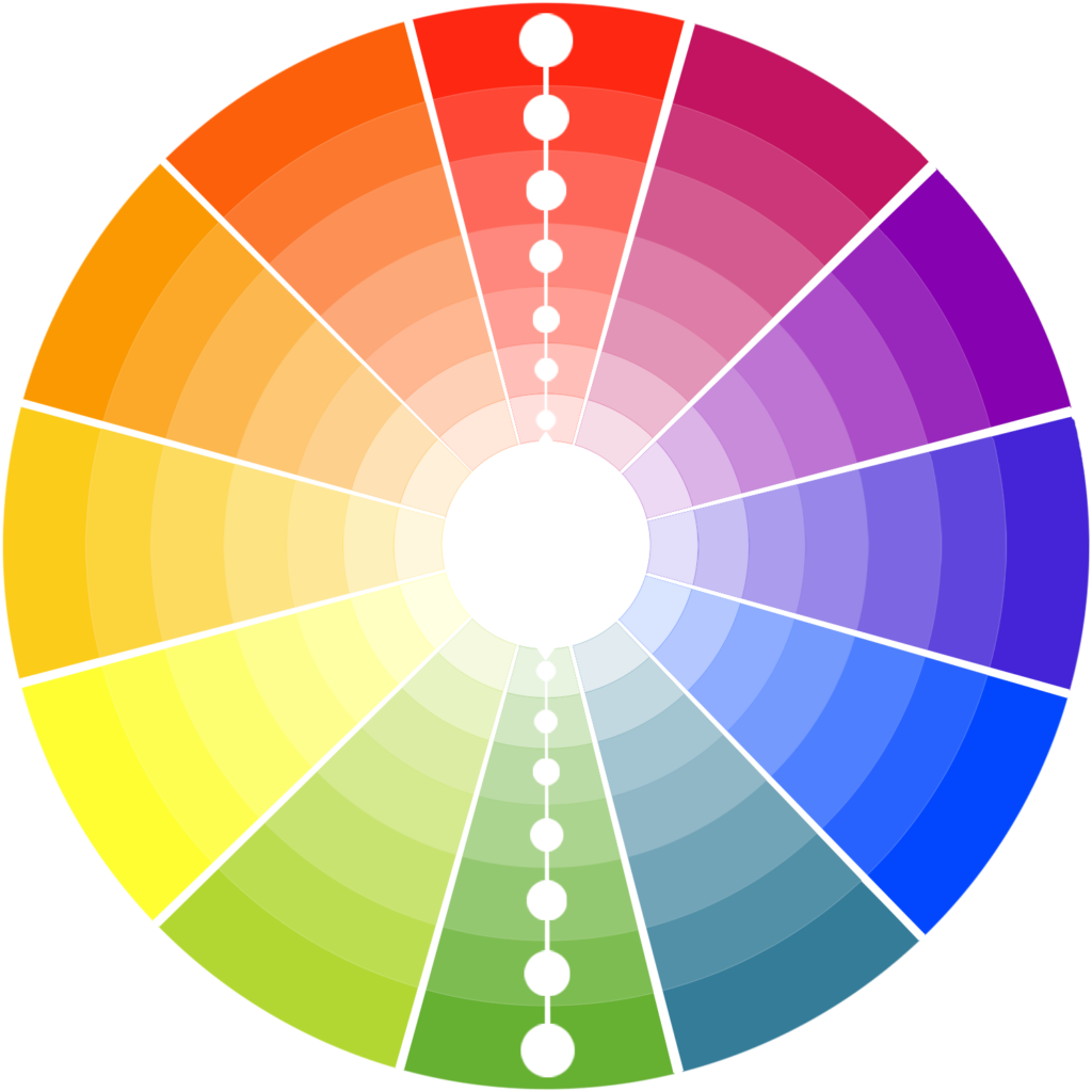
What Are Complementary Colors?
Imagine a color wheel, like a circle with different colors around it. Complementary colors are the ones that sit directly across from each other on this wheel. When these colors are placed side by side, they make each other look brighter and more vibrant.
Red and Green: Think of how a Christmas tree looks with its green branches and red decorations.
Blue and Orange: Picture a beautiful sunset with a bright orange sky and a calm blue ocean.
Yellow and Purple: Imagine a field of purple lavender flowers with the yellow sun shining above.
These color pairs create a strong and lively contrast, making your design pop.
Why Are Complementary Colors Important?
Complementary colors are important because they help your design catch people’s eyes. The contrast between these colors is bold and exciting. It makes your design stand out and gives it energy. At the same time, these pairs of colors also bring balance to your work, which makes it pleasing to look at.
How to Use Complementary Colors in Your Designs
Let’s go through an example to see how you can use complementary colors in your design projects.
1. Picking a Main Color:
Imagine you are designing the brand for a new, modern restaurant. This restaurant is known for its creative food and lively atmosphere. You decide to use a deep shade of blue as the main color. Blue is calm and elegant, which is great for the restaurant’s classy look.
2. Adding a Complementary Color:
Next, you choose a complementary color to add some contrast. Since blue is your main color, the opposite color on the wheel is orange. Orange is warm and full of energy. It’s the perfect match to make the design exciting. Use orange in small amounts, like on the menus or as part of the logo. This way, it adds interest without overpowering the blue.
3. Keeping a Balanced Look:
It’s important not to overdo it with bright colors. To keep the design balanced, mix the blue and orange with neutral colors like white or gray. For example, you could use blue for the main parts of the design, like the signage and packaging. Then, use orange as a pop of color on small details. This will make your design eye-catching but not too overwhelming.
4. Being Consistent:
Make sure to use your chosen colors everywhere in the brand. This includes the restaurant’s logo, website, and even the decor inside the restaurant. Using the same colors across everything makes the brand look professional and helps people remember it.
5. Creating Feelings with Colors:
Colors can also make people feel different emotions. Blue often makes people feel calm, safe, and professional. Orange, on the other hand, makes people feel excited, warm, and creative. By combining these two colors, you create a brand that feels both trustworthy and full of life. This helps connect with customers on a deeper level.
Why You Should Use Complementary Colors?
Using complementary colors in your designs is like adding a special touch. These colors work together to create a strong and memorable impression. Whether you are designing for a business, an advertisement, or a piece of art, complementary colors can make your work shine. They help your designs stand out, convey the right emotions, and leave a lasting impact on anyone who sees them.
So next time you will work on a design, try using complementary colors. You’ll see how much more vibrant and exciting your work can become!