Soothing colors have a unique way of telling stories and capturing the essence of different times. From 2015 to 2019, we’ve seen a wide range of colors that have influenced fashion, design, and even our everyday lives.
Every year we were introduced to new colors. Some were bold and adventurous, while others were calm and soothing. These colors didn’t just look good—they reflected the trends, moods, and events of their time.
In this guide, we’ll take a closer look at some of these memorable colors, including their HEX codes, which are like the special fingerprints of each shade.
The Rise of Bold and Calming Colors
During these years, we saw a mix of vibrant and serene colors. Bold colors like deep reds and bright yellows were popular because they brought energy and excitement.
Softer tones like pastel blues and gentle greens became popular for their calming effect. These colors were often used in spaces where people wanted to relax and unwind. The combination of bold and calm colors created a balanced palette that catered to different tastes and needs.
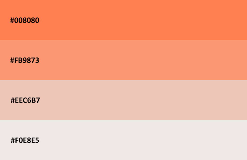
2019
2018
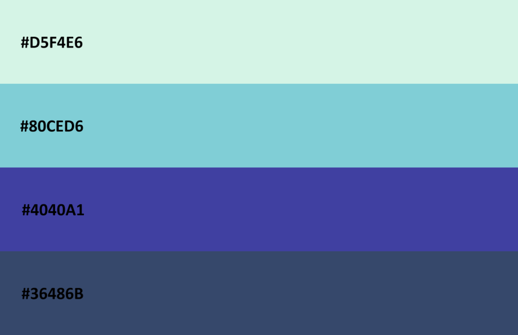
2017
Making Your Walls Look Great
When it comes to decorating our homes, wall colors play a big role in setting the mood. In the past few years, some color trends stood out as favorites for walls. Earthy tones like warm browns, soft greens, and creamy whites were always in style. All these colors made rooms feel cozy, grounded, and elegant. They are the kind of colors that never go out of style.
But if you want to add more personality to your space, vibrant colors are the best choice. Fiery reds, ocean blues, and golden yellows were popular for adding a pop tone. These shades brought energy and life to a room. Whether you were looking to create a peaceful retreat or a dynamic space, these color trends offered endless possibilities for expressing your style.
2016
2015
Conclusion: The Power of Color
Colors are more than just visual elements—they influence how we feel and how we experience the world. The color trends from 2015 to 2023 show us how powerful and versatile colors can be.
Whether you prefer the calm of earthy tones or the excitement of vibrant hues. The above color palette can help you create the perfect space. By understanding these trends, you can make informed choices about the colors you use. Which ensure that your spaces not only look great but also feel just right.